Bandra was once a leafy suburb of Mumbai city. In recent times it has become a vibrant yet highly dense neighbourhood, symptomatic of the crunching space in Indian metropolises. As a result, the floor space of an average household gets more and more constrained and precious. This forces some to leave the neighbourhood and move further away from the city centre. But for others it means that they’ll have to make do with less space. This increasing problem has been ingeniously addressed in a 7th floor apartment in Bandra.
The apartment has an adaptable and open arrangement. Dispensable walls between rooms were removed and replaced with objects in order to optimize space. Because walls can be opened and closed, folded or sliding away, the home can be restructured, expanded, fragmented, connected or isolated. In order to optimise space, every wall, nook and surface has been put to multiple uses.
The interior is minimal yet intricate in detailing. However it is embellished with a subtle collection of textures and materials. Each utility core is therefore materialized either in stained birch plywood, natural stained white oak or an epoxy cement finish. While the birch plywood of the bookshelves have been stained in a subtle yellow, the edges have been exposed. A charcoal stained wall of birch plywood hides the wardrobes in the master bedroom. Furthermore, a white oak veneer wall defines the character of the kitchen and hides the equipment and accessories behind it. Each material defines the character of the space. They have their own unique character and definition, while at the same time they do not compromise on the feeling of spaciousness.
The interactive layout of the apartment allows you to walk around the house in multiple ways. Because every room has at least two ways to go to another, it gives the illusion that there are many more rooms than there actually are. Additionally the complexity of spaces prevents a quick and easy mental map of the apartment to be formulated and encourages one to explore the house in different ways. Therefore the house feels much larger than it is.
The challenge of apartments in a city like Mumbai is to be able to experience the outdoors. The apartment faces a generous park on the west and captures the sea breeze. But the city noises and dust are omnipresent. Because the sliding doors have been custom designed with double glazing, they keep noise outside. At the same time, they create a visual connect with the outdoor dining verandah. But they can also fully slide away and hide in a pocket in the wall so that the living room can physically connect with the park outside when required.
Project Name
Casa Brio
Location
Bandra, Mumbai, India
Year
2017
Type
Themes
Flexibility, Typology
Design Team
Size
80 sq.m.
Program
Residence
Photographer
Publications
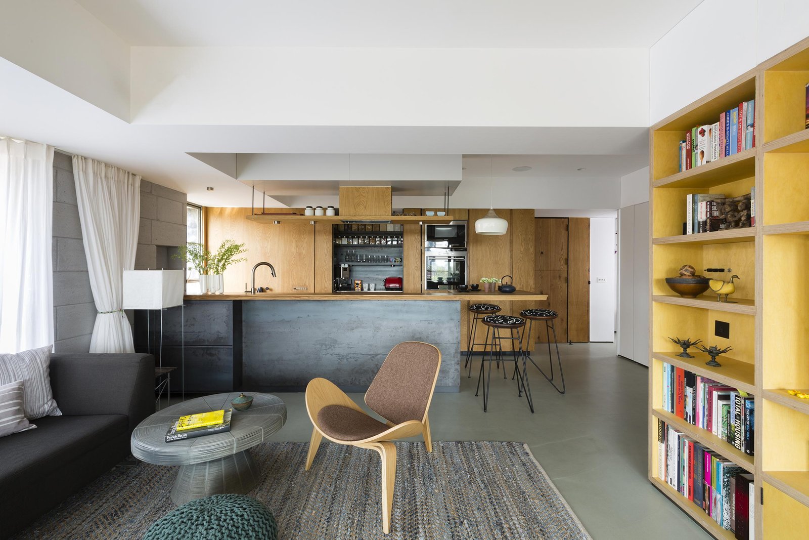
The living room and the open kitchen are connected. The shift in the walls and the yellow stained birch plywood bookcase defines them spatially.

The design of the kitchen feels warm and homely. In order to avoid the kitchen from overpowering the living room, the usual daily utility clutter is strategically kept out of sight.

Large customised steel sliding windows can be tucked away in a secret pocket opening the Living Room up to the Verandah
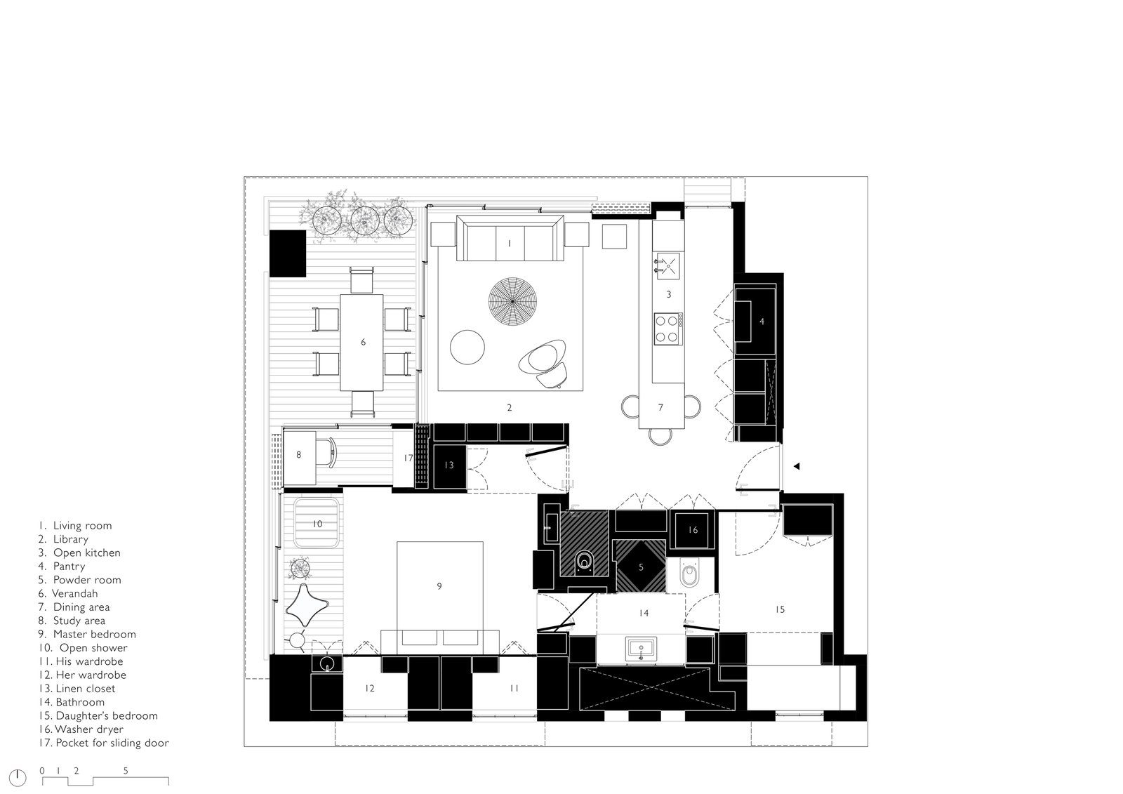
Floor Plan
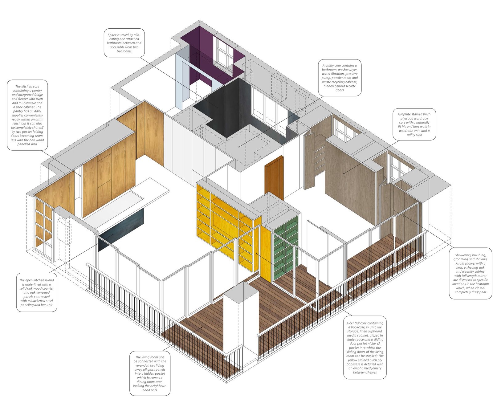
Axonometric View: two central cores and two peripheral cores intersperse the floor plan and define and characterise them at the same time.

Living Room and Open Kitchen


Brass sliding tracks laid in timber floor
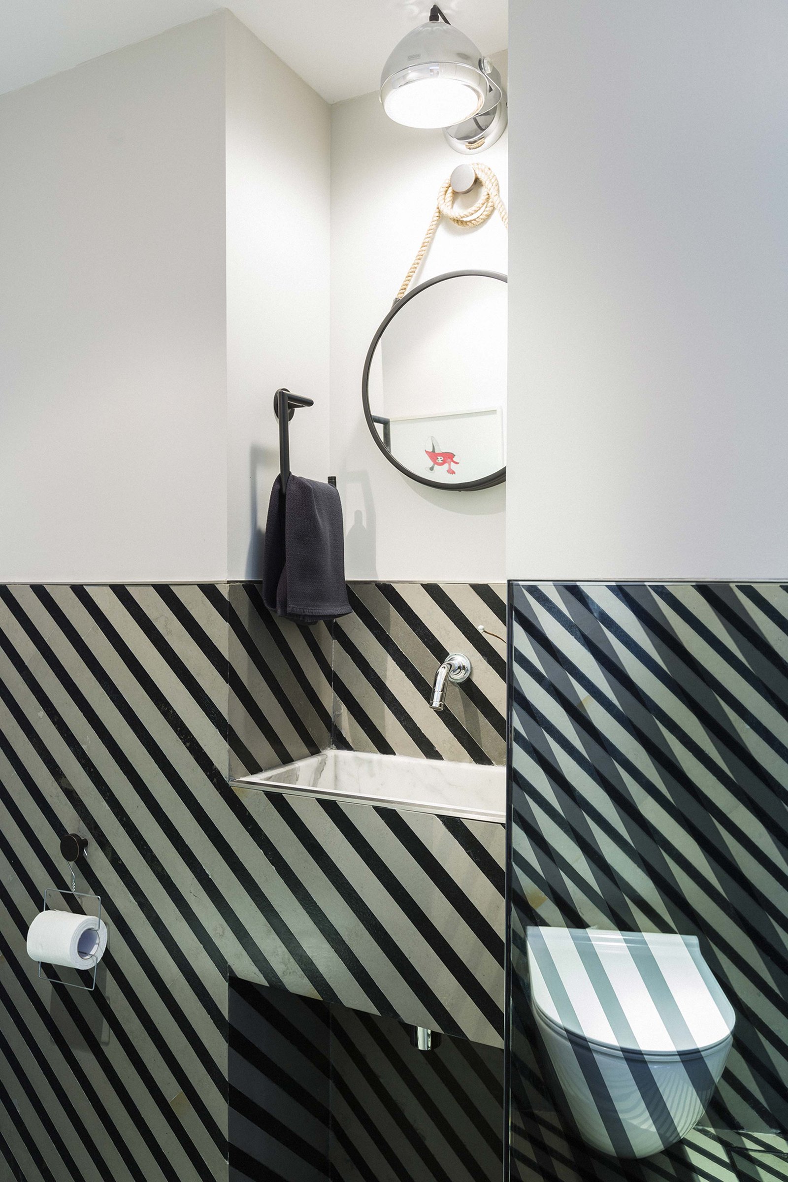
Powder Room

A sliding wall opens the study to the bedroom

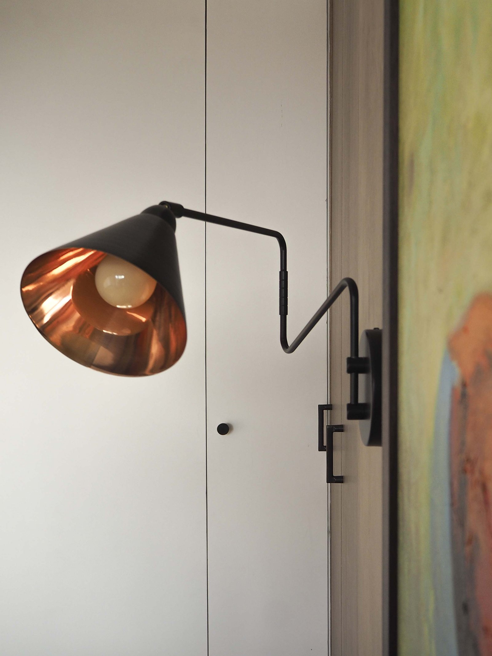
Detail of Artwork by Ruwan Prasanna

The bedroom shower has a view of the park

Bedroom Sink

Customised toggle switches on a birch plywood wall
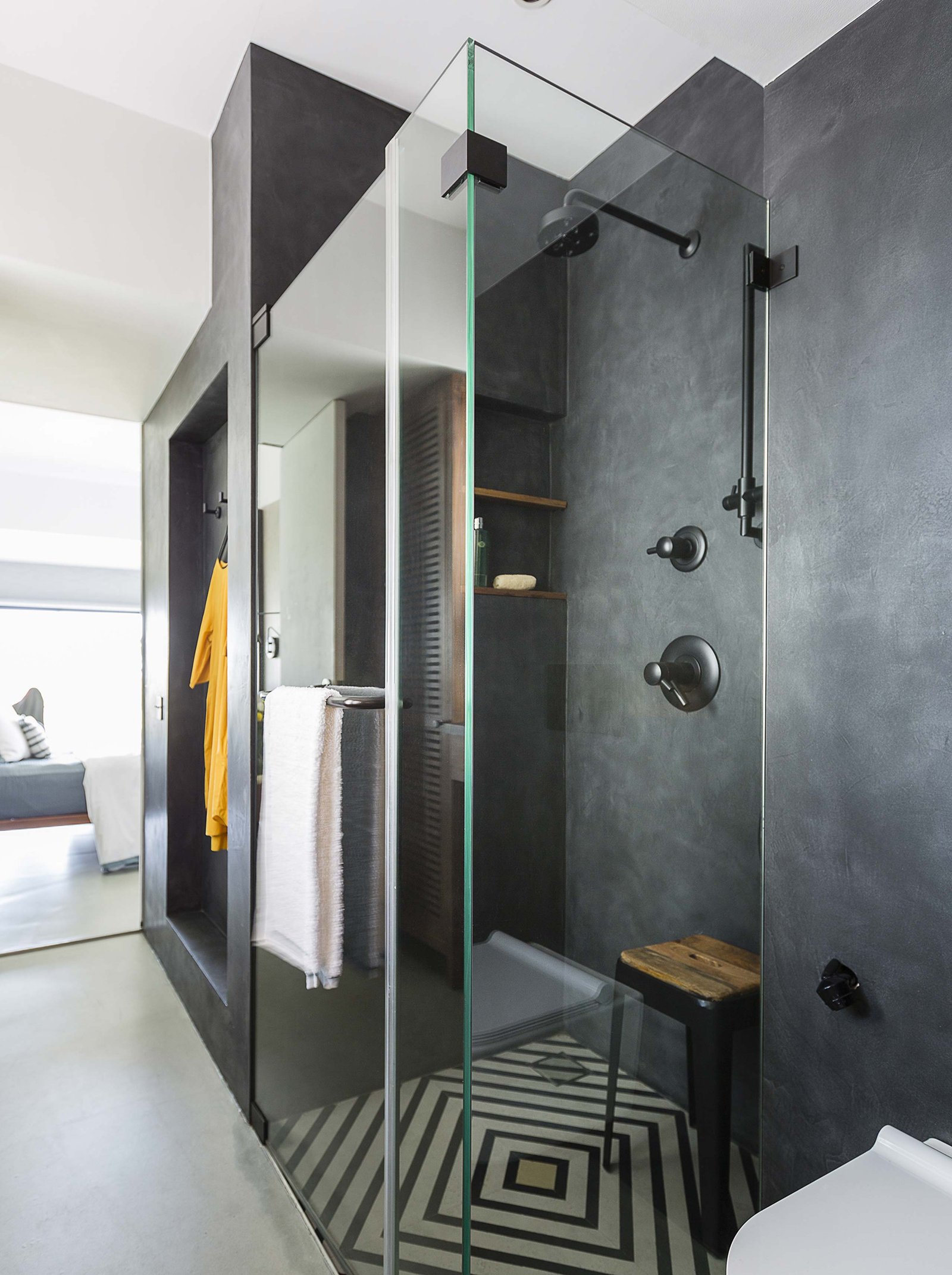
In order to save space, the renovation combined two bathrooms to make one generous bathroom accessible from both bedrooms.
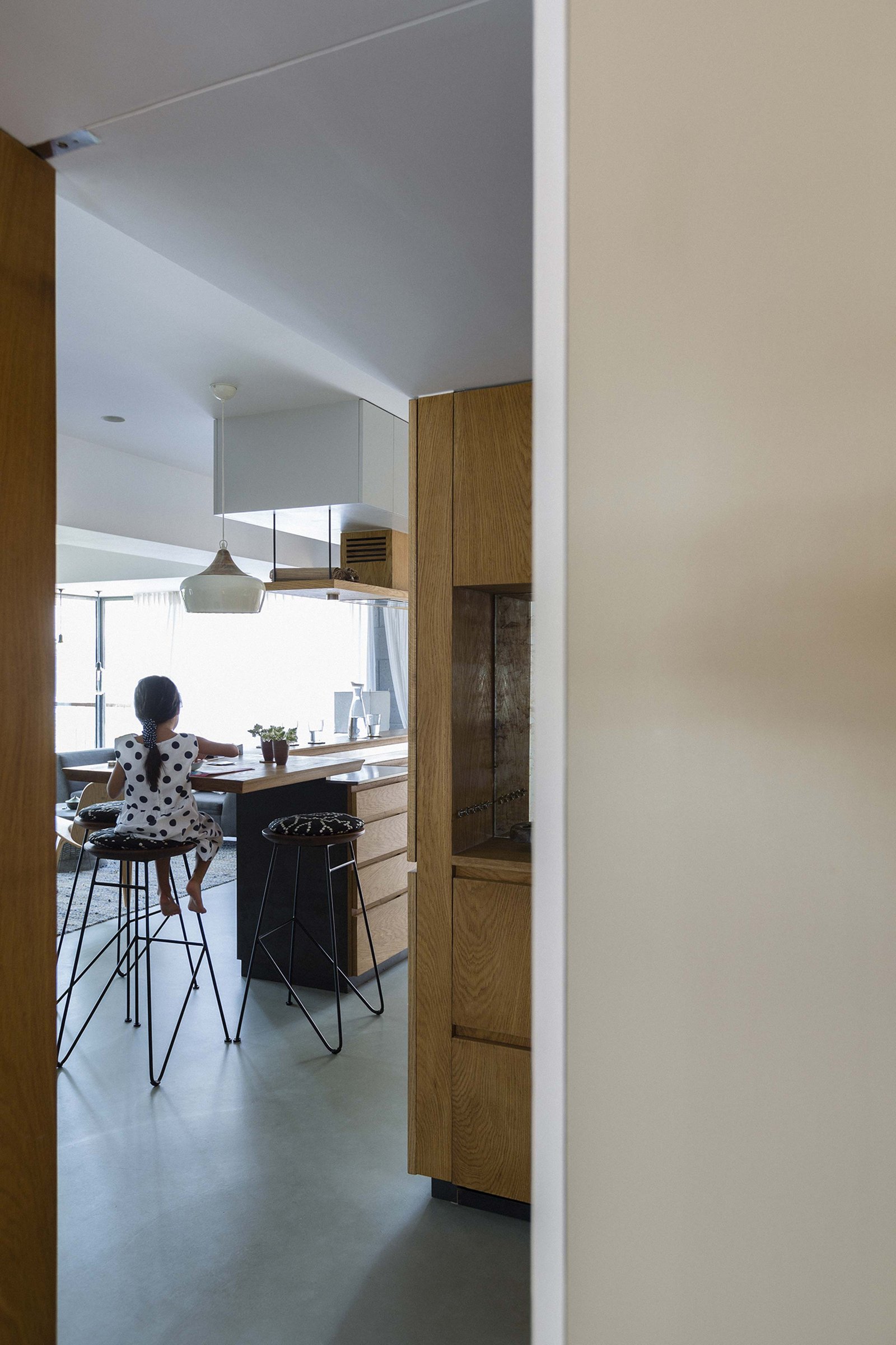
A glimpse of the Kitchen from the Child’s Bedroom